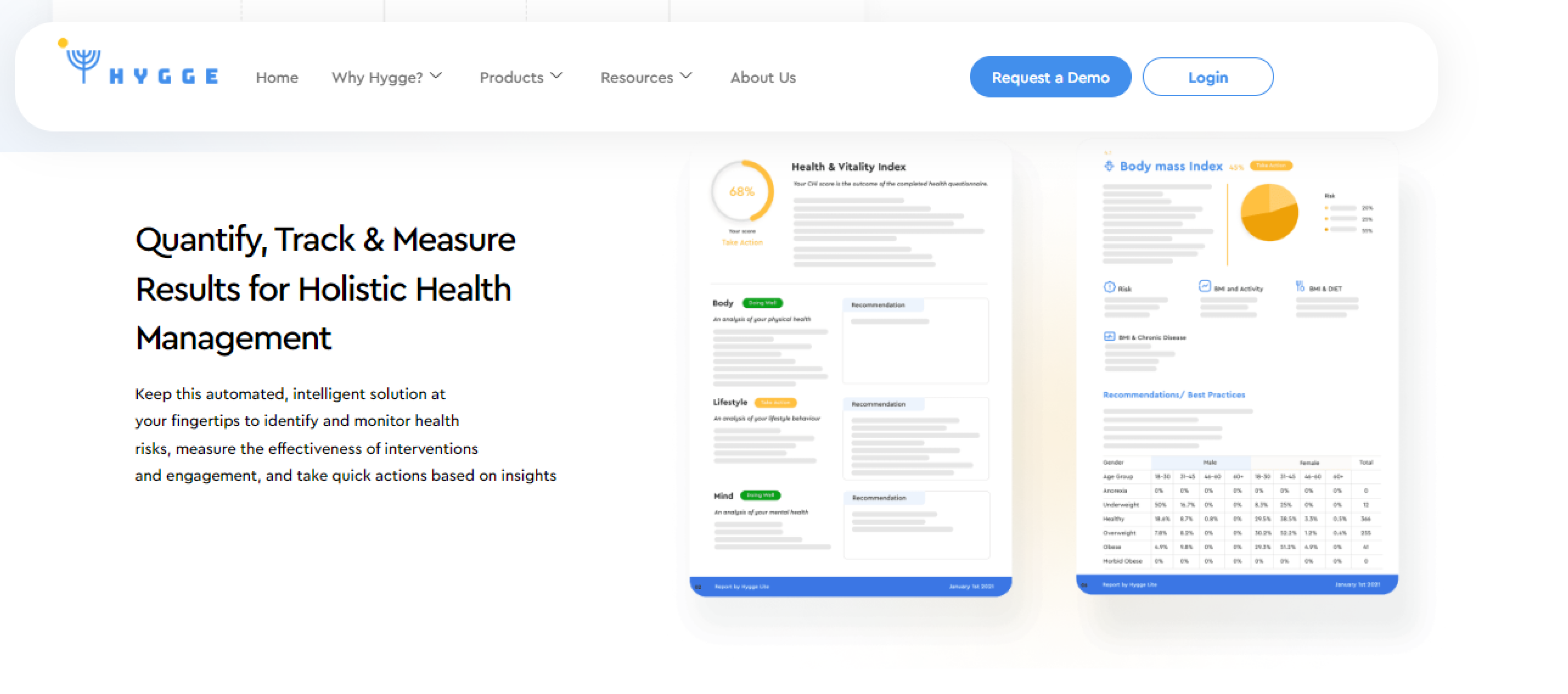
My Hygge is a healthcare company committed to improve wellbeing by offering extensive corporate healthcare benefits. They use data analytics and health risk assessments to create customized lifestyle treatments by simplifying health evaluations. Their approach helps employers to recognize health concerns and implement strategies for healthy and balanced lives.
In today’s fast-paced world, finding the ideal work-life balance is becoming increasingly difficult. Hygge, pronounced ‘Hue-guh,’ is a Danish term that refers to a sense of total well-being and comfort. Our client My Hygge main aim is to help businesses to create healthier workplaces, lessen employee stress, and promote work-life balance. In addition to fostering employee health, this balance also improves longevity and retention, which reduces the risk of lifestyle-related illnesses such as diabetics, obesity and many more.
However, Hygge’s logo and website no longer matched its mission—like many expanding businesses do. That’s where Stifftech Solutions came in.
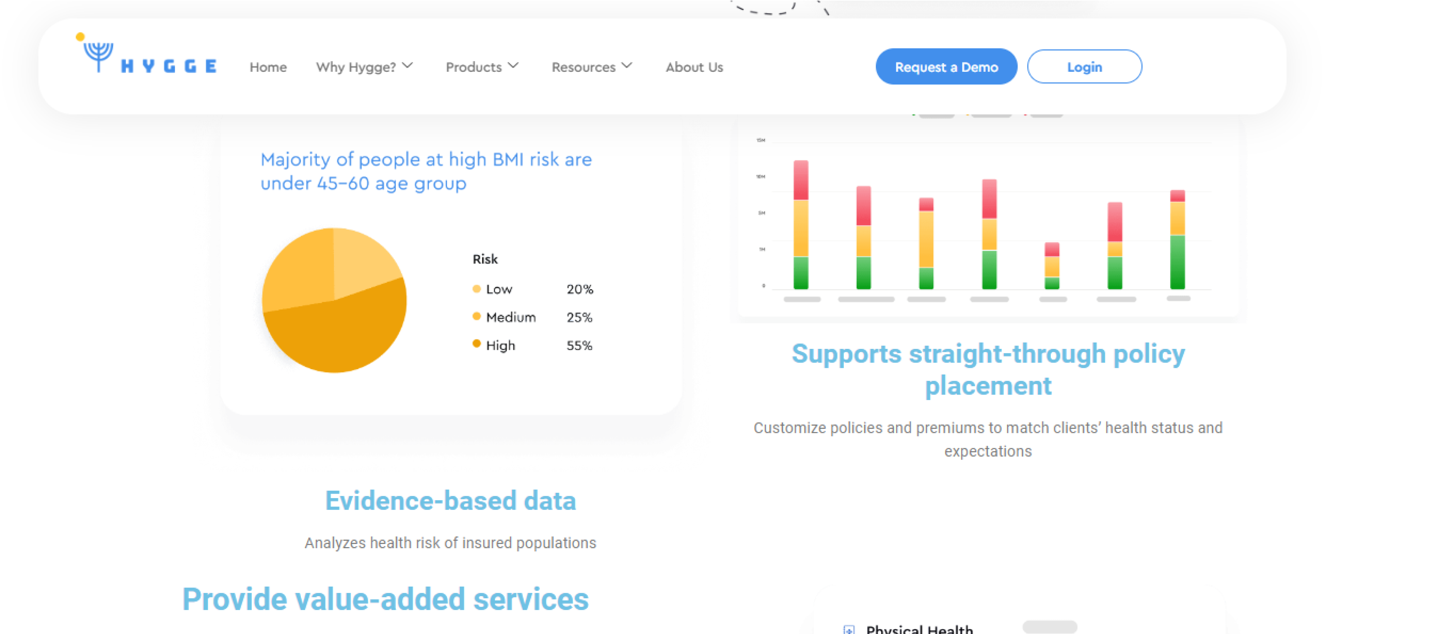
My Hygge’s brand identity changed along with its evolution. In order to better reflect its principles of comfort, well-being, and corporate wellness, the company underwent a thorough rebranding, upgrading their logo, color scheme, vision, and mission statement. The difference between its website and new brand, however, was substantial. They completely changed their company’s representation. The business found it difficult to attract potential customers due to outdated designs, content, and lack of interactive aspects.
However, their website includes outdated representation, so they were unable to communicate its message of comfort and long-term health to customers, so they contacted Stifftech to revamp it.
The objective was obvious when My Hygge contacted Stifftech Solutions which is to develop a website that will both engage users with a contemporary, dynamic experience and represent their new brand identity. Stifftech recognized that this was more than simply a revamp; it was a chance to rethink how My Hygge presented the advantages of corporate healthcare to the public.
Stifftech suggested a complete custom development option. This would make it possible to customize the new website to precisely match Hygge’s distinctive branding and corporate wellness programs. The site would be constructed from the ground up, guaranteeing a smooth alignment with their new vision.
Many healthcare companies fall into the trap of developing static, full of content websites that fail to engage the audience. So, redesigning a healthcare website can be daunting.
1- Adding interactive videos
One of the most effective methods to increase user engagement is through interactive videos. We included captivating videos that highlight our client’s services, and emphasize the value of workplace well-being in order to illustrate the company’s corporate healthcare advantages.
2- Intuitive design
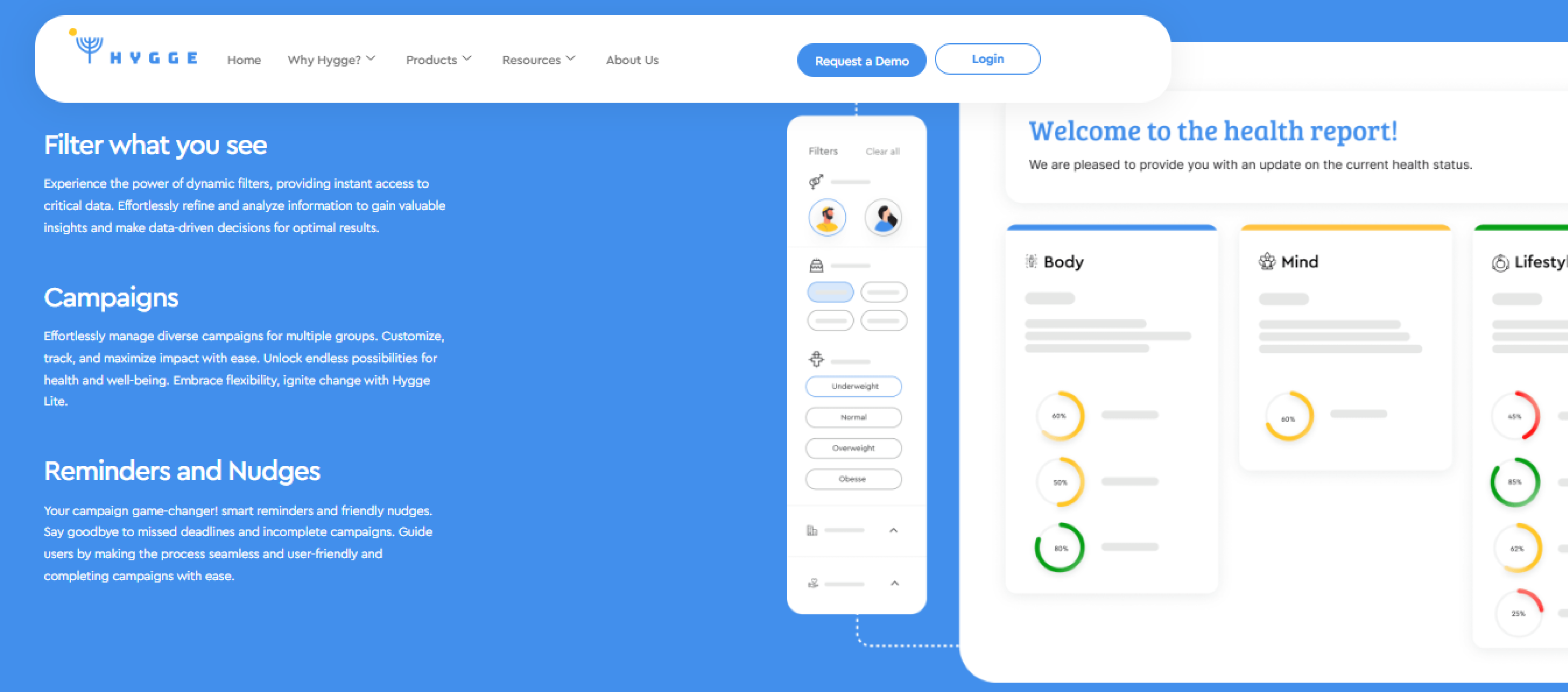
Stifftech updated the website’s layout to showcase a sleek, and contemporary style. We also focused on improving the user experience (UX), making sure the website was easy to use, responsive, and adaptable to mobile devices.
3- Boosting engagement with extra pages
We added more pages to increase engagement. The purpose of each of these pages was to captivate customers, urging them to browse the website more and discover the advantages of using Hygge.
4- Including Chatbots
Stifftech added live chat capabilities, enabling users to ask queries and receive prompt responses with the help of chatbots. As a result, the website became more dynamic, enabling customers to obtain the information they required.

Including interesting videos, more pages, and live chat bots prompted users to spend more time on the website and discover more about My Hygge’s offerings, which resulted in an increase in website engagement. A website revamp that aligned with Hygge’s redesigned logo, color palette, and mission further strengthened the brand’s coherence.
Stifftech Solutions has provided us with an amazing website that is both aesthetically pleasing and incredibly functional. They have given us a customized website based on my requirements.
My Hygge

Contact us now and let our team of industry experts propel your business to new heights.

United Arab Emirates
Contact us now and let our team of industry experts propel your business to new heights.

United Arab Emirates